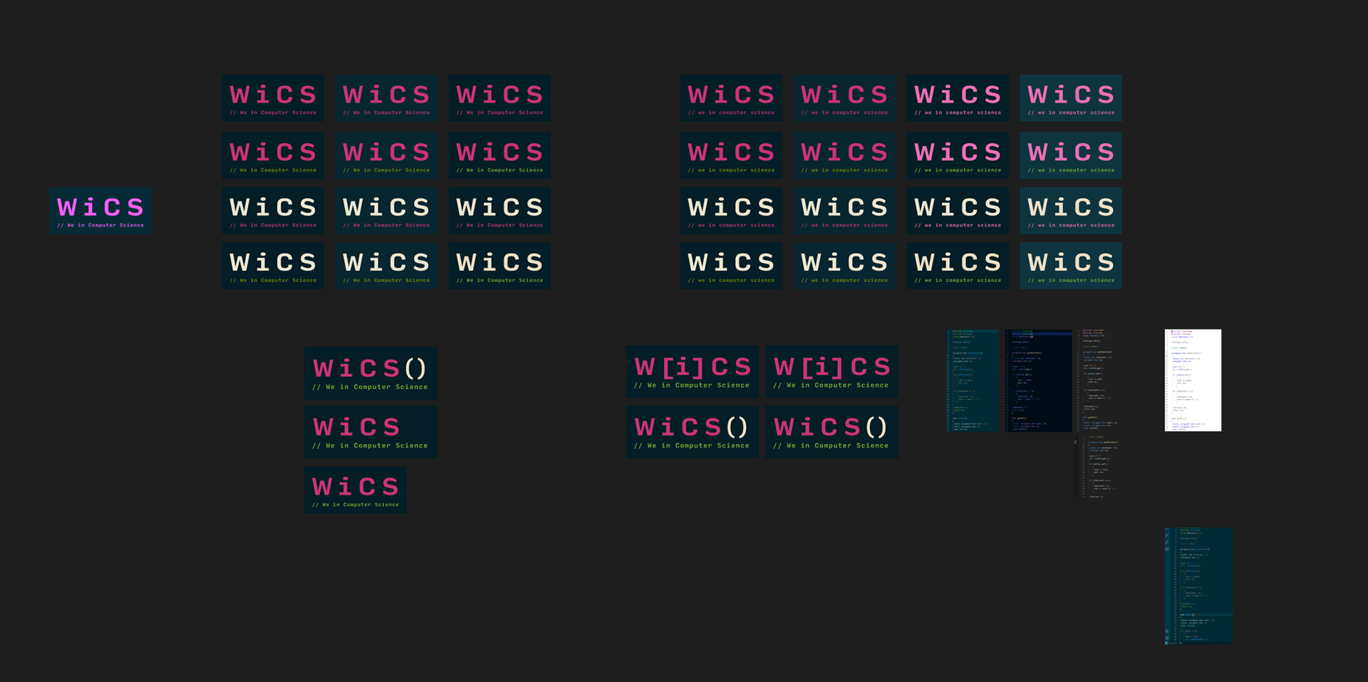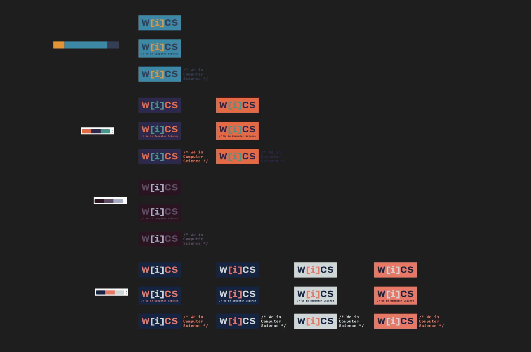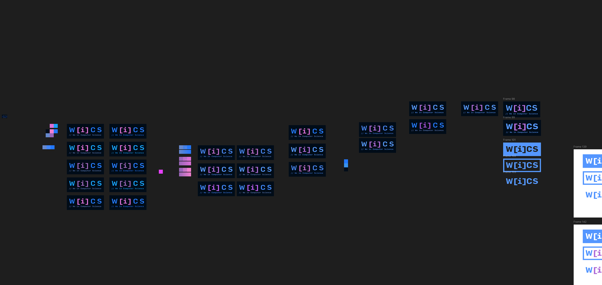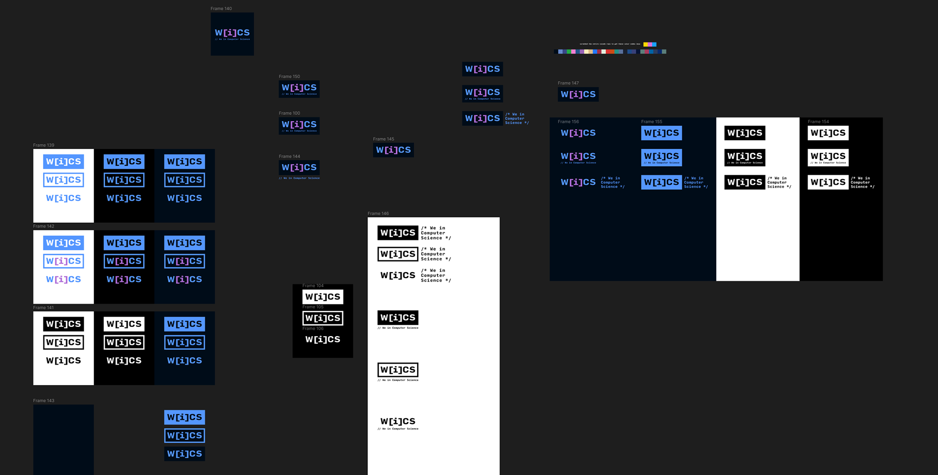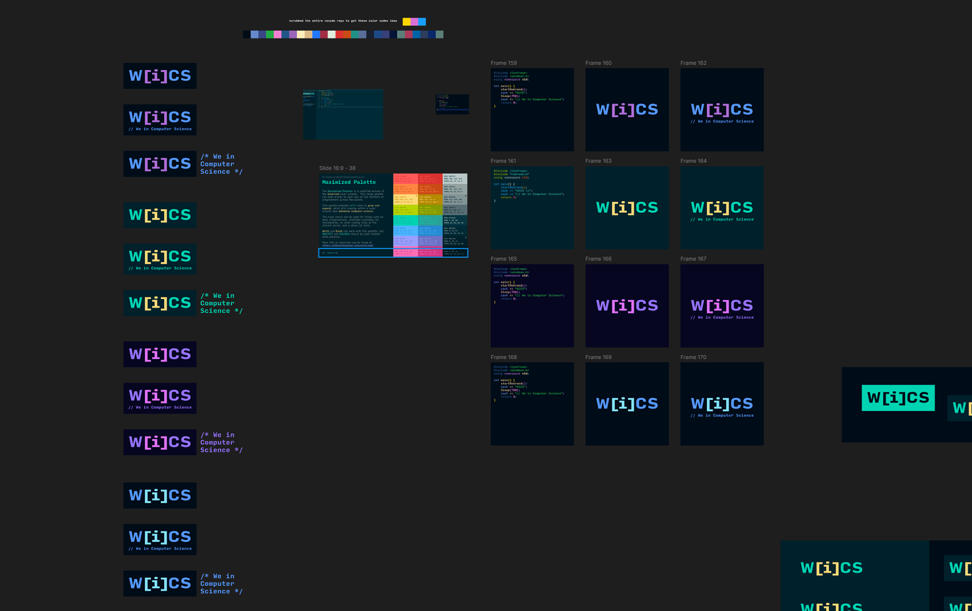
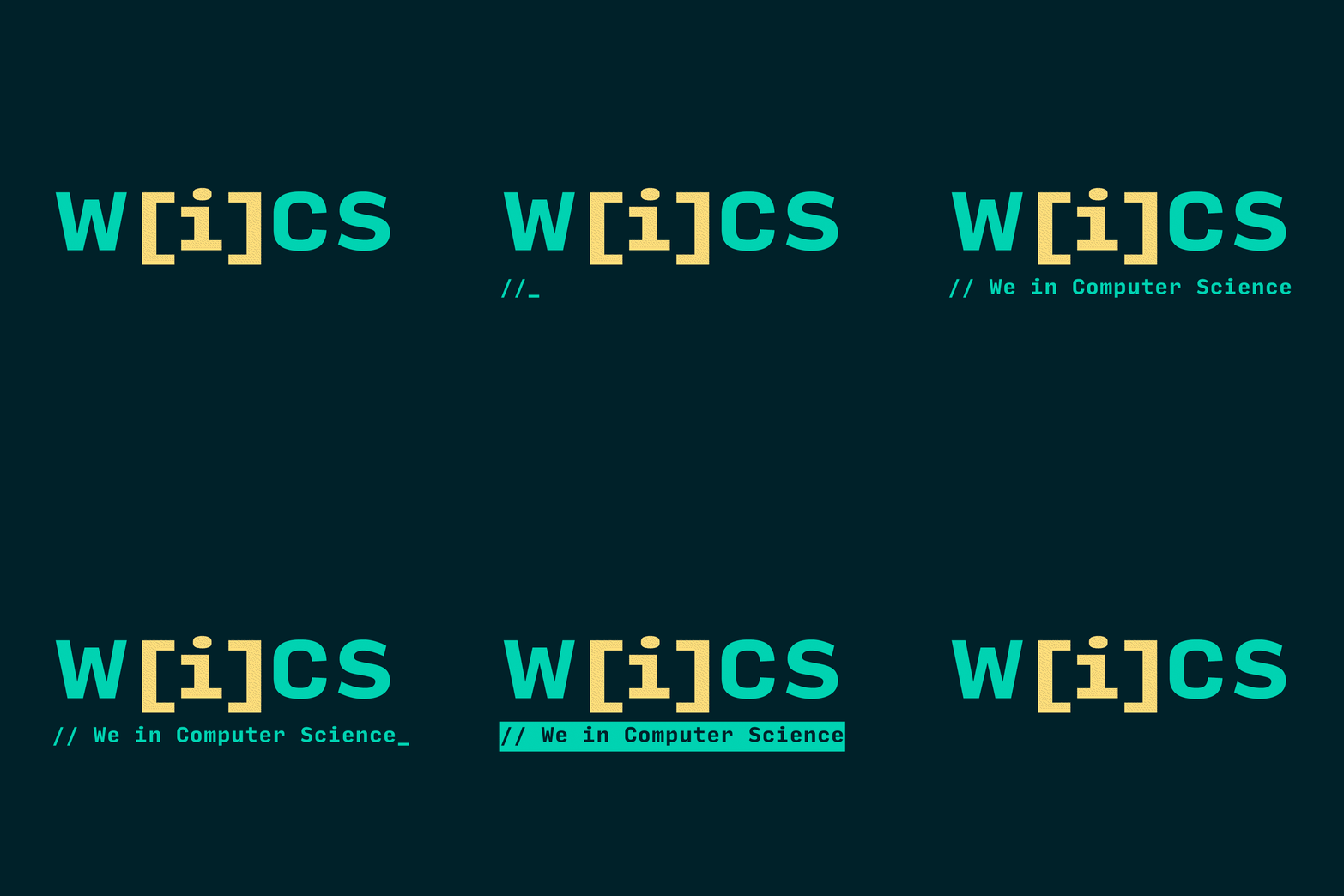
In order to convey WiCS commitment to the computer science community, I dug deep into WiCS brand history, and C++ syntax to find inspiration in code.
I landed on [i], a symbol WiCS had used before, and the de-facto notation when accessing data within an array; essentially programming shorthand for "a single part of a greater whole".
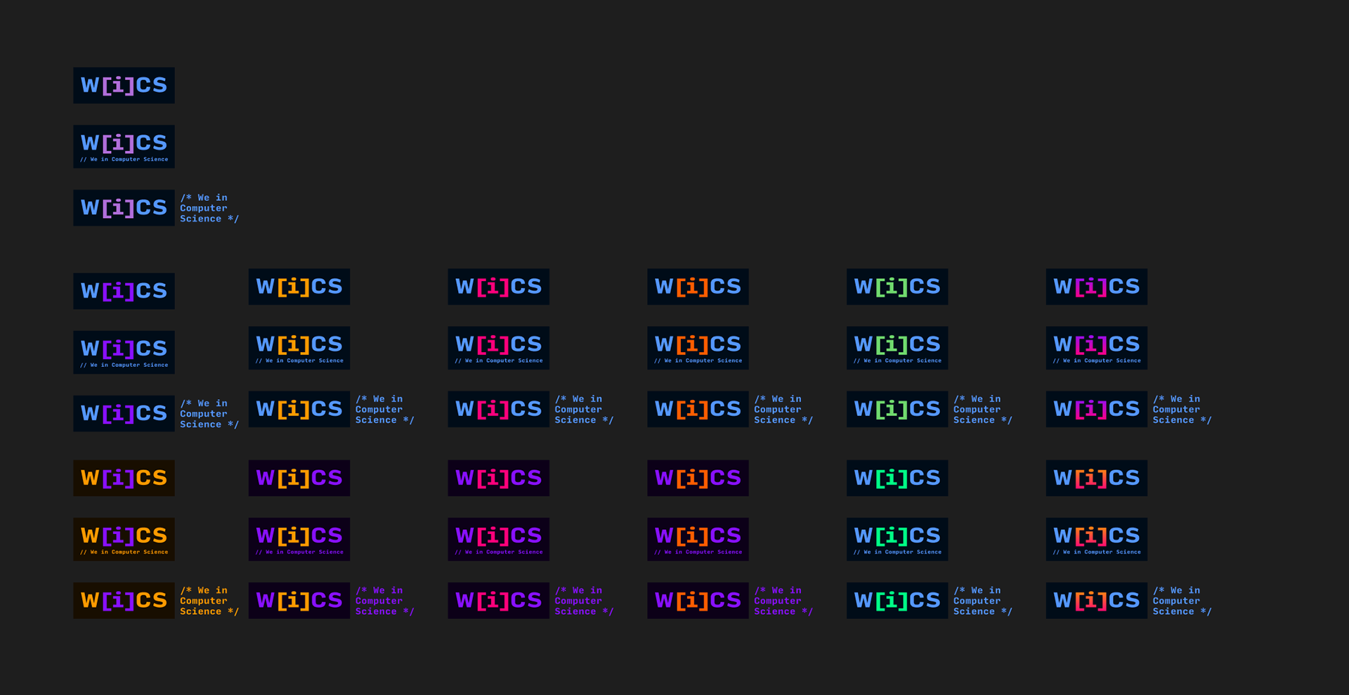
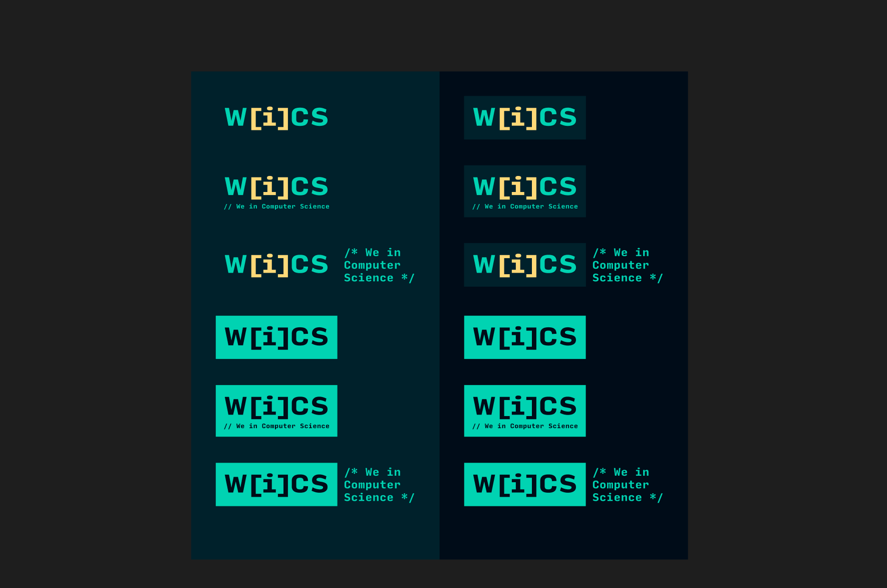
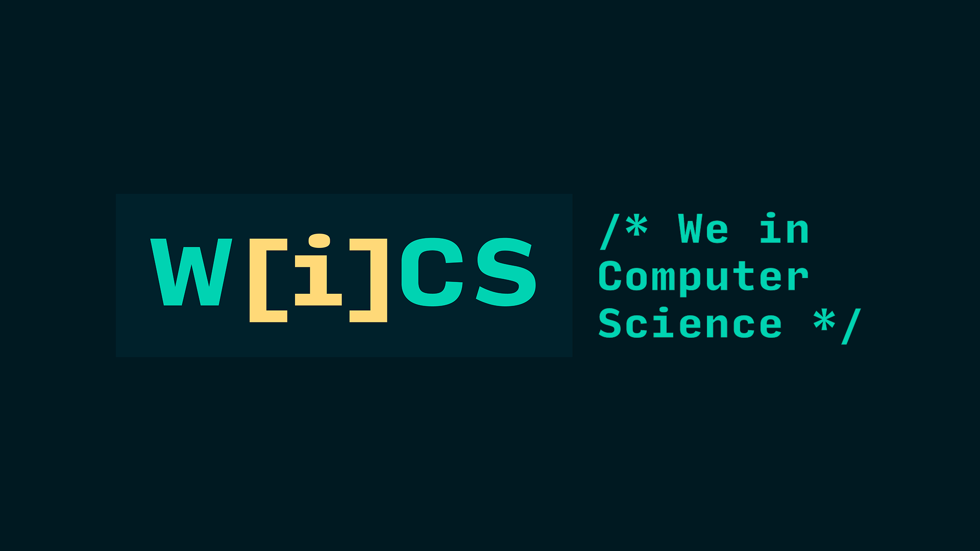
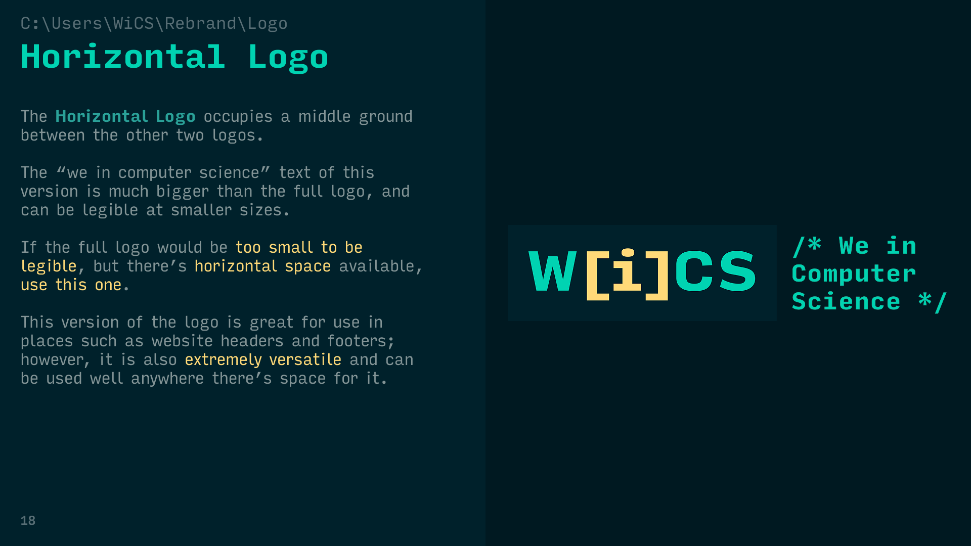
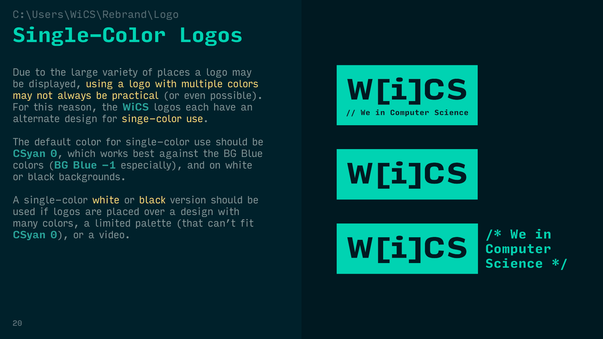
To state the org's full name on the logo, I used "//", the C++ syntax for single-line comments. For the horizontal version, I used the multi-line comment syntax: "/*" and "*/".
Student organizations completely cycle their leadership within 3-5 years. In order for the brand to have longevity, a comprehensive style guide that could be passed down between leadership generations was an absolute necessity.
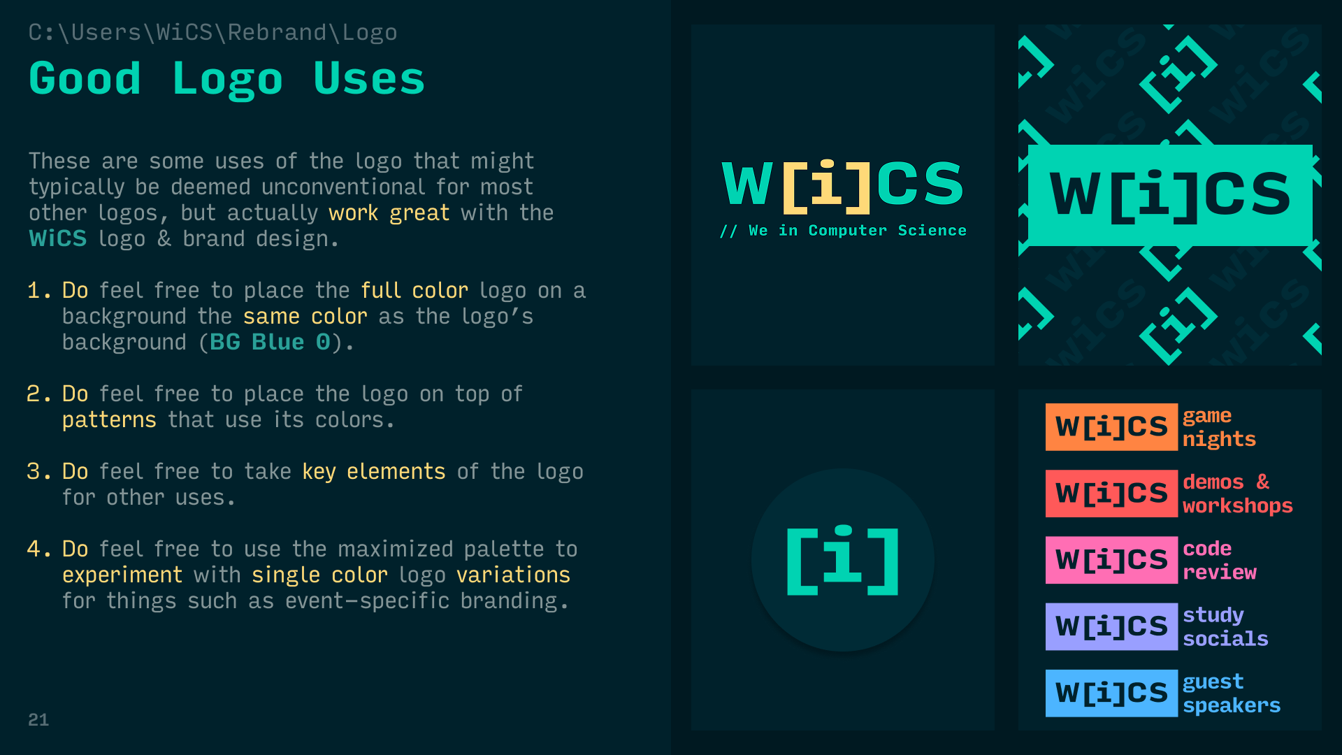
Color was a major pain point of WiCS prior branding. The matrix green palette they had before felt too restrictive, and past attempts to introduce additional new colors didn't land.
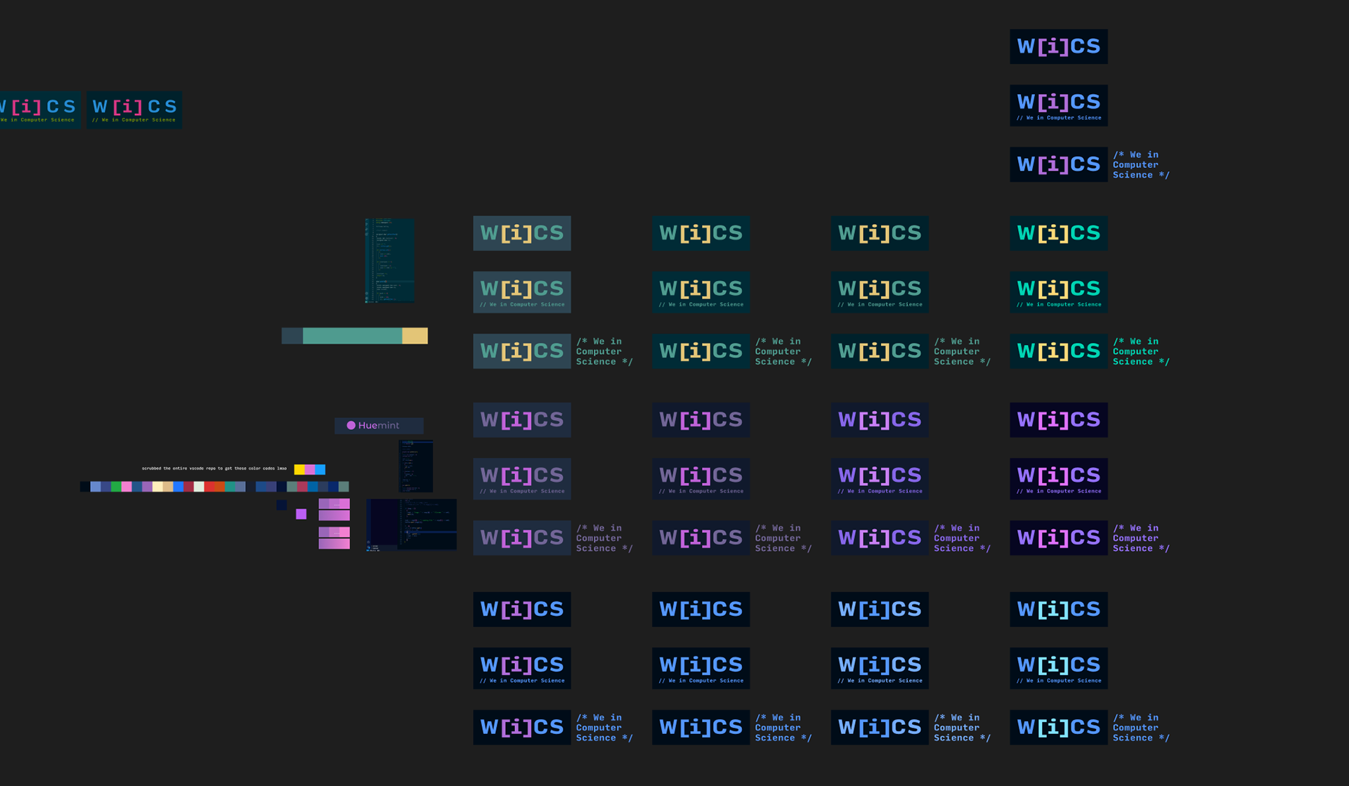
I designed a 3-tiered color palette for WiCS: a primary palette to anchor the brand, a secondary palette to cover hierarchy, and an extended palette to facilitate growth.
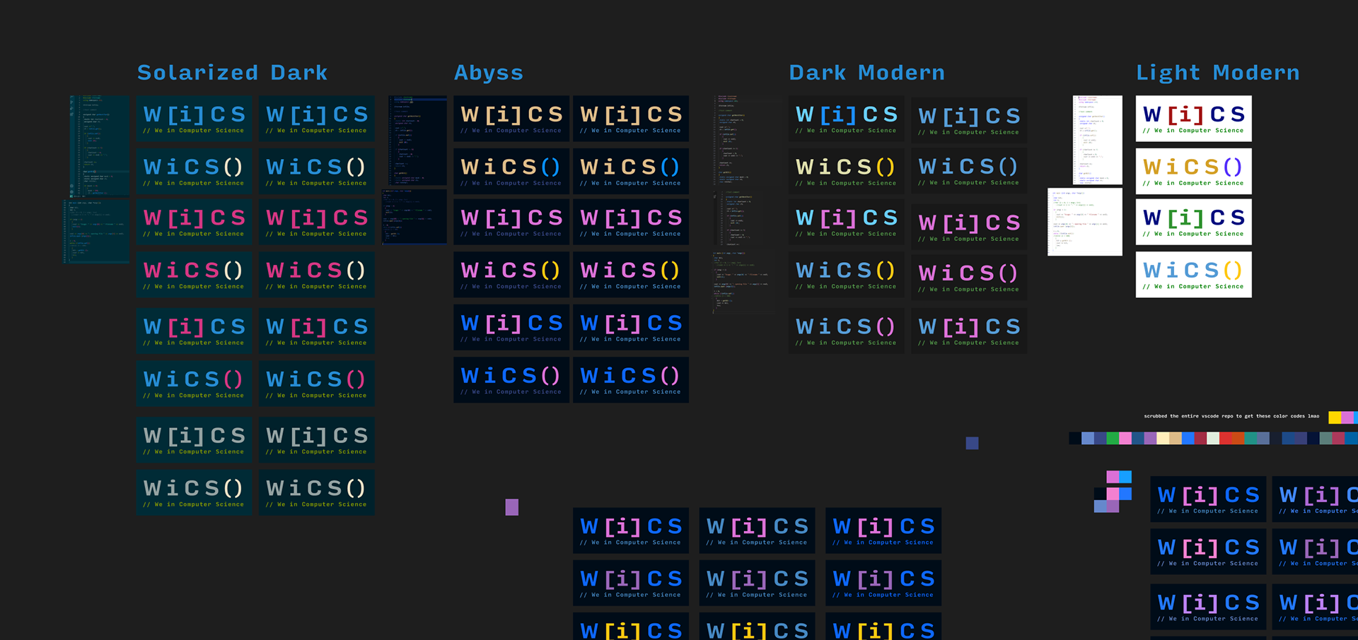
The palettes are inspired by the Solarized theme, used in programming text editors across the globe.
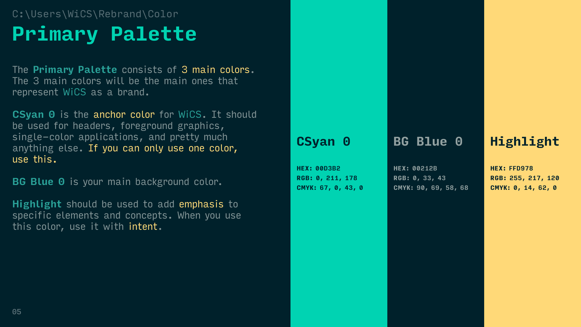
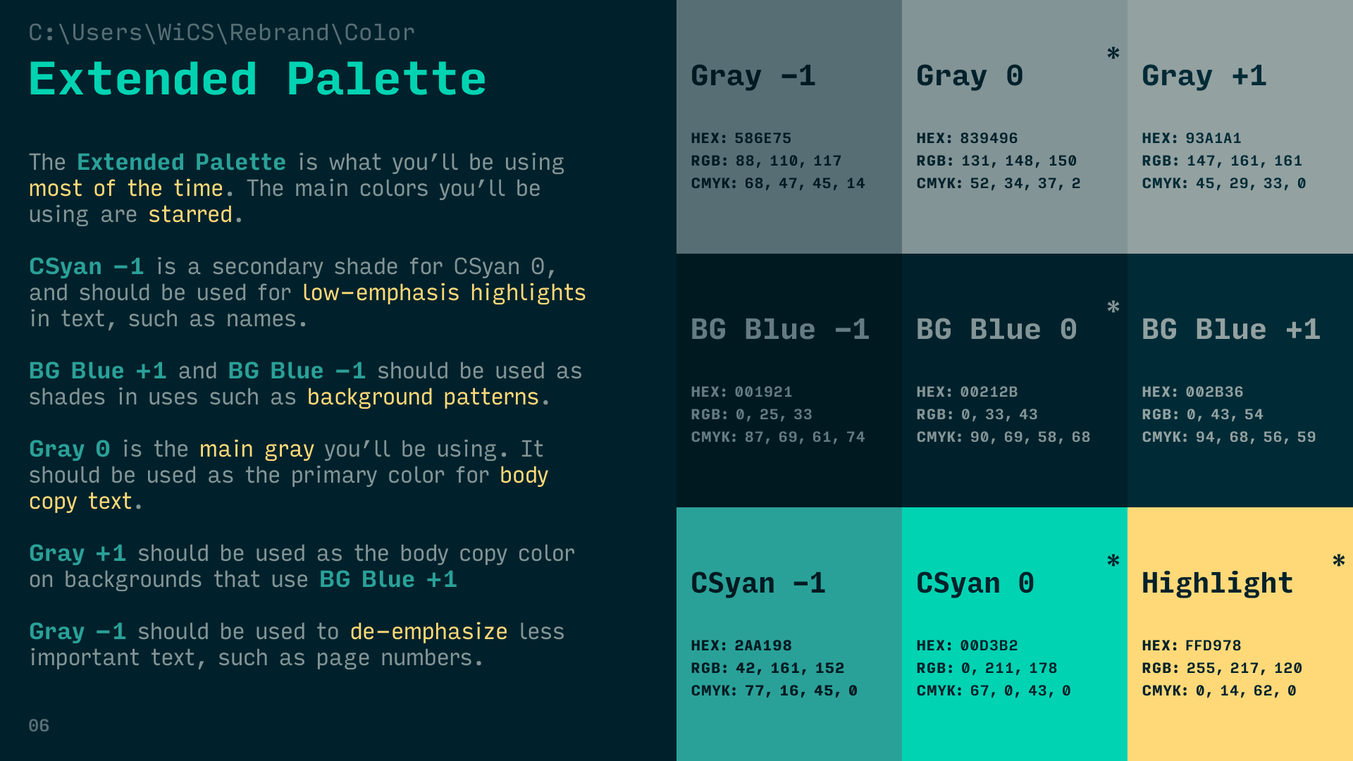
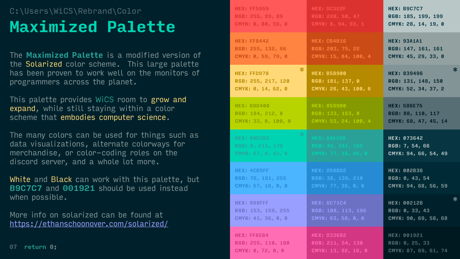
Finding the palette that felt right for WiCS was a difficult balance, and required multiple revisions. Over 70 color palettes were tested before landing on the final palette.